Thursday, March 28, 2019

Field Notes - Platform: Yuneec H520


For this lab, it was meant to make a session with a Yunecc H520. We started by splitting up into two groups. One group walked to the flying area to lay out the Ground Control Points. The second group stayed with Professor Hupy and the platform and went through assessment of altitude, and the pre-flight steps that included the sensor, accelerometer and compass calibrations. We were instructed to fly a little bit outside the chosen area to avoid distortions. Regarding overlapping images, generally, a 75% frontal and 60% side overlap is considered to be adequate. However, since we were in a forest, even if it was not that dense, an 85% frontal and 70% side overlap would be safer. Below is some initial metadata.

Location: Martell Forest
Date/ Time: 3/26/2019, 11:20 am EST
Platform: Yuneec H520 
Sensor: E90
GCP: AeroPoint markers
Altitude: 80 meters
Weather/ conditions: Clear skies, little wind, 50 degrees F, 0% precipitation
Datum: NAD 83 2011
Pilot: Lucas Wright 

Figure 1: Professor Joseph Hupy engages the UAV.

Figure 2: Yuneec H520 

We powered up the transmitter and programmed the flight-path into the software. We would start to fly at 80 meters in altitude with the sensor in nadir view (straight down). Thereafter the idea was to fly with an oblique angle of 45 degrees. After starting the platform we switched the transmitter's connection to the platform itself.

Figure 3: The platform's joystick.

Figure 4: Pre-flight setup

GCPs are used to increase the overall accuracy of a model. These are marked locations in the area of interests that utilized GPS for their exact location. When collecting images with UAS, the synchronization between the GPS and the images can have bad quality. For GCPs to be effective one needs a minimum of 3 points, but in our case, we used 9. More than 10 does not contribute to increase accuracy. Using GCPs and especially with them well distributed helps increase accuracy. The accuracy for these AerioPoint markers are 2-3 centimeters.

Figure 5 The GCPs, well distributed around the area.

Figure 6: Before take off
Unfortunately, the UAV came down after just some seconds flying and we only brought one platform. This was probably due to some partial disconnection between the battery and the platform, but sure the battery was loaded. This is something that can happen in the realm of UAS but in order to minimize human error and for it not to happen a checklist should always be up. If possible, let the flight coordinator help the operator with the checklist. A general checklist may include many of the features below:

Checklist
PRIOR TO TRAVEL
⬥Location confirmation
▢ Confirm location with client(s)
▢ Confirm date with client(s)
▢ Confirm availability of observer
▢ Minimum takeoff/landing area confirmed (50 ft radius)
▢ Obstacles are noted and mapped

⬥Permission to fly
▢ Property owners’ approval
▢ FAA Part 107 approval (if flying <5 miles of airport)
▢ NOTAM filed (if flying <5 miles of airport)
▢ Participants’ approval (if flying over people)
▢ Part 107 waiver filed and approved (if necessary)
▢ Check current NOTAMs for flight area
▢ Area clear of aircraft

⬥Weather
▢ Weather report printed
▢ Temps: 32°-104°F
▢ Wind: 0-22 mph
▢ Visibility: >3 sm
▢ Ceiling: >500 ft

⬥Aircraft
▢ Software updated
▢ Repairs made from previous flight
▢ No damage to aircraft
▢ SD card formatted
▢ Spare propellers packed
▢ Emergency repair kit packed

⬥Controller
▢ Software updated
▢ Fully charged

⬥Batteries
▢ Fully charged


PRE-FLIGHT
⬥Set up
▢ Verify area clear of obstacles
▢ Measure area EMI
▢ Place takeoff/landing pad
▢ Observer present

⬥Power up
▢ Remove gimbal cover
▢ Place aircraft on launchpad
▢ Power up controller
▢ Power up aircraft
▢ Confirm controller-aircraft connection
▢ GPS: >8 satellites
▢ Calibrate IMU
▢ Calibrate compass
▢ Confirm video feed
▢ Confirm gimbal movement

⬥Failsafes
▢ Return to home: Battery level <20%
▢ Return to home: Lost link
▢ Land in place: GPS signal lost


IN FLIGHT
⬥Takeoff
▢ Select flight mode
▢ Select manual/automatic takeoff
▢ Takeoff

⬥In Flight
▢ Climb to mission altitude
▢ Proceed to mission destination
▢ Maintain visual line of sight
▢ Monitor wind speeds/heading
▢ Monitor aircraft GPS location
▢ Monitor battery percentage
▢ Complete mission

⬥Landing
▢ Verify clear path home
▢ Select manual/automatic landing
▢ Land safely


POST FLIGHT
⬥Power down
▢ Power down aircraft
▢ Power down controller
▢ Remove props
▢ Secure gimbal

⬥Data collection
▢ Download photo/video data
▢ Record flight time in logbook

Thursday, March 7, 2019

Calculating Impervious Surface Area


Introduction


For this week we were supposed to learn how to Classify aerial images to determine various surface types. This was done through an Online tutorial at ESRI's webpage, found here.

Since many impervious surfaces are a danger, many governments charge landowners that have high amounts of impervious surfaces on their properties. To calculate fees it is important to segment and classify aerial imagery by land and calculate the area of impervious surfaces per land parcel. To decide which parts of the ground are pervious and which one are impervious, one has to classify the imagery into land types. Typically, impervious surfaces are generally human-made such as buildings, roads or parking lots. To start with, change the band combinations to distinguish features clearly. After that one shall group pixels into different segments, which will reduce the number of spectral signatures to classify.

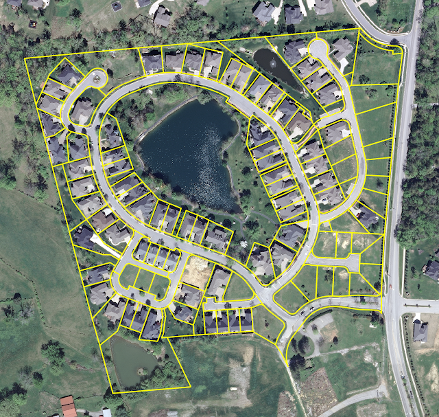
The map includes a feature class of land parcels and a 4-band aerial photograph of an area near Louisville, Kentucky.

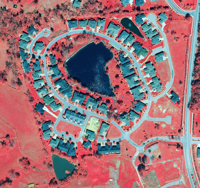
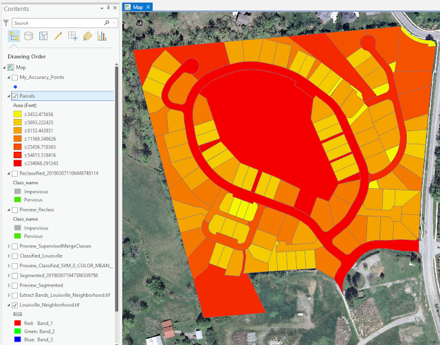
Figure 1: A neighborhood near Louisville, Kentucky.

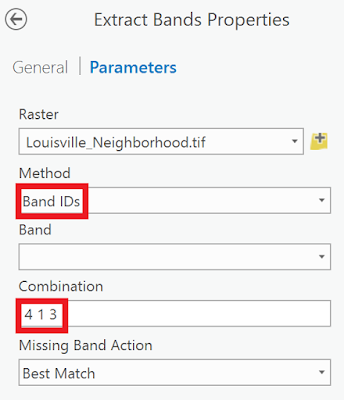
Right now, the imagery uses the natural color band combination to display the imagery the way the human eye would see it. Next step is to change this band combination to better distinguish urban features such as concrete from natural features such as vegetation.

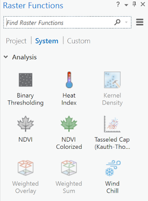
Figure 2: Raster Functions

Figure 3: Other Raster Functions options, not used here.

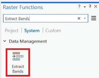
Figure 4: Extract bands


Figure 5: Changing band combination


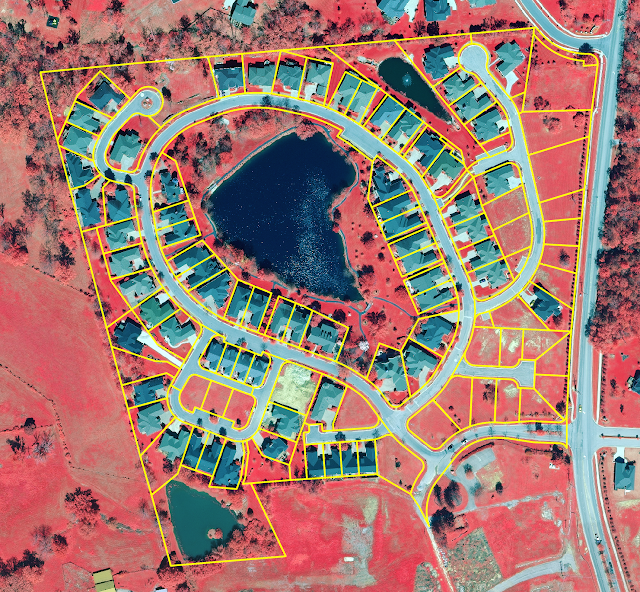
The result displayed below.

Figure 6: The results and the parcels included


The new layer displays only the extracted bands. In order to make some features easier to see, I will turn the yellow parcel layer off.

Figure 7: Without the parcel layer


Vegetation appears as red, roads as gray, and roofs as shades of gray/blue-ish. It will be easier to classify the surfaces later when emphasizing the difference between natural and human-made surfaces.

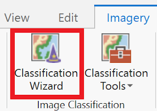
Make sure that the Extract_Bands_Louisville_Neighborhoods layer is selected, then select the Classification Wizard.

Figure 8: Start the Classification Wizard


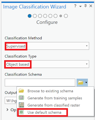
This time, I will use supervised classification method. This method is based on user-defined training samples. Also, I will use an object based classification which uses a process called segmentation to group neighboring pixels based on the similarity of their spectral characteristics.

Figure 9: First step in the Classification Wizard


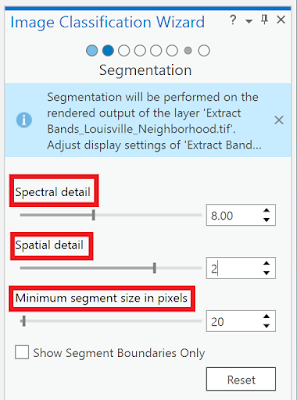
Next step is to segment the image. Instead of classifying thousands of pixels with unique spectral signatures, it saves time and storage to classify a much smaller number of segments. Mainly, there are three parameters to take care of: the spectral detail, the spatial detail and the minimum number of segment size in pixels. As instructed I use these number below.


Figure 10: Second step in the Classification Wizard

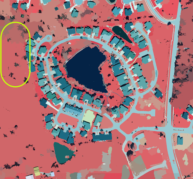
Especially on the left side of the image, vegetation seems to have been grouped into many segments that blur together.

Figure 11: Segmented result


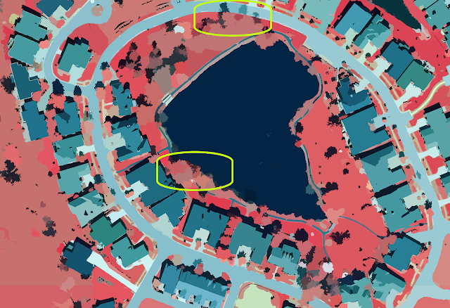
This image is being generated on the fly, which means the processing will change based on the map extent, if it is zoomed in or out. At full extent, the image is generalized to save time. The image below is zoomed in to reduce the generalization. By doing so, one can better see what the segmentation looks like.

Figure 12: Some differences


I have now extracted spectral bands to emphasize the distinction between pervious and impervious features. Then I grouped the pixels with similar spectral characteristics into segments, simplifying the image so that features can be more accurately classified. After these steps, I will classify the imagery by different levels of perviousness or imperviousness. When classified the segmented image into only pervious and impervious surfaces, the classification would be too generalized and likely have many errors. By classifying the image based on more specific land-use types, the classification becomes more accurate.

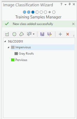
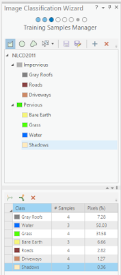
I put in the numbers once more. On the Training Samples Manager page of the Classification wizard, I right-clicked each of the default classes and remove them. And added some new classes with new values.


Figure 13: Third step in the Classification Wizard


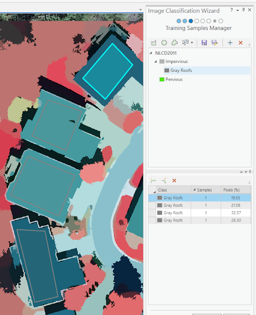
On some roofs I drew polygons and made sure the polygons covered only the pixels that comprise the roofs.

Figure 14: Drawing polygons


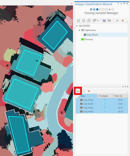
I have only drawn training samples on roofs, each training sample currently exists as its own class. I want all gray roofs to be classified as the same value, so I will merge the training samples into one class. I selected every training sample and clicked the Collapse button below.

Figure 15: Collapse button demonstrated

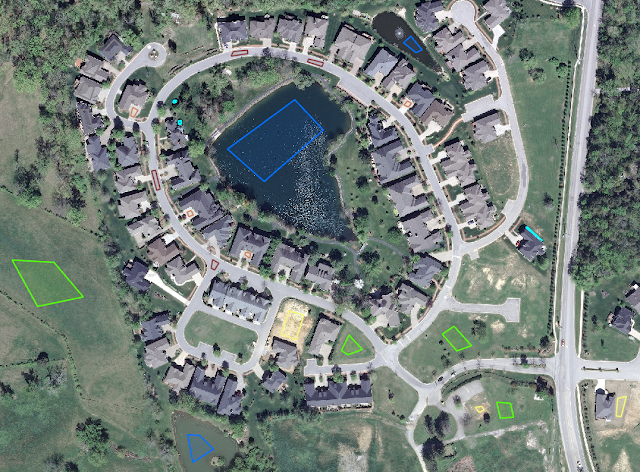
After creating the different feature classes I did went looking on the map for every one of them
.
Figure 16: Finishing third step


Figure 17: The normal view with the polygons I created

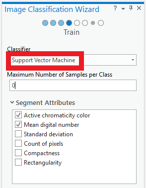
When satisfied after finishing my training samples, it is important to save the editing. Next phase is to choose classification method. I will use the so-called Support Vector Machine.

Figure 18: Fourth step in the Classification Wizard

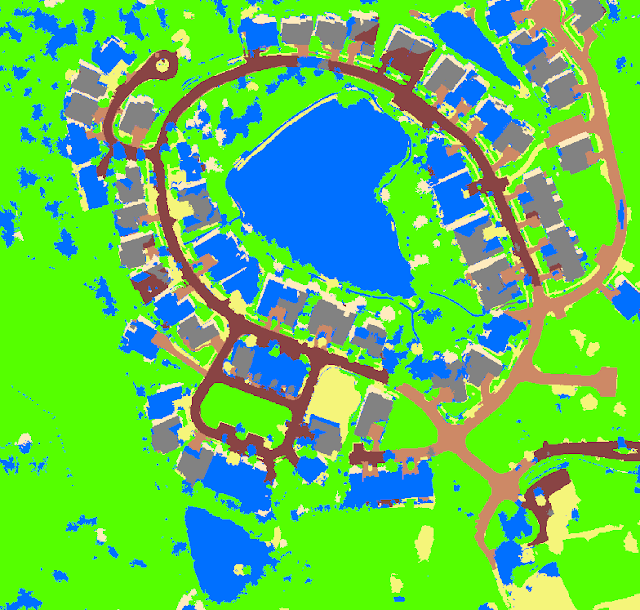
On the map is a preview of the classification I just made. The classification preview is pretty accurate, even the muddy pond central bottom was classified correctly. However, it is pretty rare that every feature will be classified correctly.

Figure 19: The classification preview


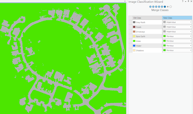
Next thing to do is to merge subclasses into their parent classes. I will merge subclasses into Pervious and Impervious parent classes to create a raster with only two classes.

Figure 20: Fifth step in the Classification Wizard


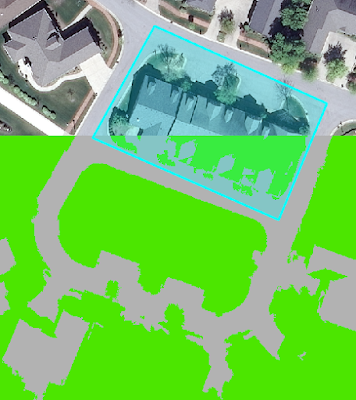
The final page of the wizard is the Reclassifier page, which holds tools for reclassifying minor errors in the raster dataset. I uncheck all the layers except the recent one created Preview_Reclass and the base Louisville_Neighborhood.tif layer. The image below shows how some roof tops was not correctly classified. However, the tool is used for when one wants to reclassify a whole area (the polygon). Since I do not want to reclassify this whole area to either pervious nor impervious I just skip this step.

Figure 21: Option to reclassify, if wanted


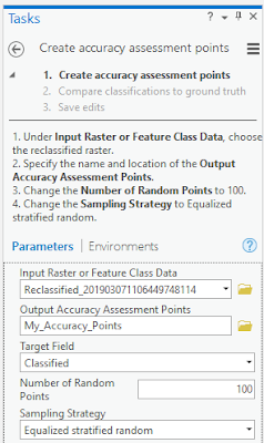
Figure 22: Creating assessment points

Conclusions


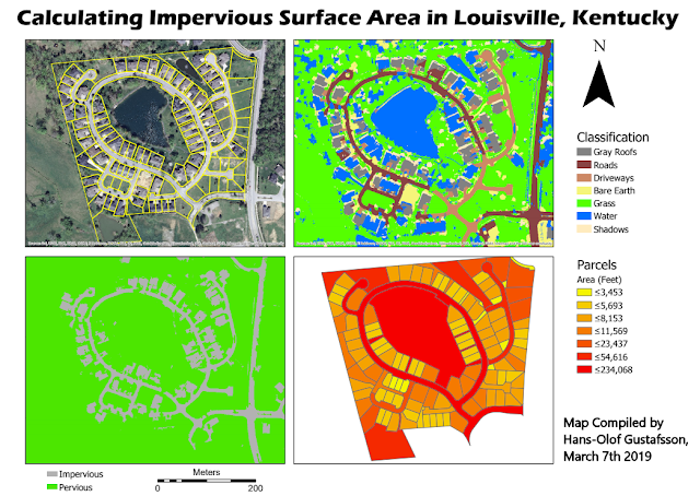
One hundred accuracy points are added to the map and the tolls added attributes to the points. The points attribute table contains the class value of the classified image for each point location. Next step is to use the accuracy points data to compare the classified image to the ground truth of the original image. After some computations this is the results I ended up with. The parcels with the highest area of impervious surfaces appear to be the ones that are red and correspond to the location of roads. These parcels are very large and almost entirely impervious and larger parcels often have larger impervious surfaces.

Figure 23: After some computations this is the results I ended up with

Figure 24: The map I created, displaying all the steps of the classification and calculations

Manifold industries and companies can get their business's growing by using UAS data to calcuate perviousness and imperviousness. When planning sites for buildings or different structures this tool would be good to use. Also, this is a good tool for accurately show how land areas changes over time, which may be used by people with other interest. Information collected by UAVs can be used to so many things, this was just another example.

Friday, March 1, 2019

Volumetrics with UAS Data


Introduction


In this lab, we were supposed to calculate the volume of an aggregate pile using both Pix4DMapper and utilizing several tools within ArcDesktop. We were working within two Geodatabases in this lab, the Wolf Creek Paving and the Litchfield Mines.

The usage of volumetric analysis, based on UAS data gathered by UAVs are well used in environments that are hard to access and where it is dangerous for humans to be. People in the industry of UAS use volumetric analysis to calculate and study areas in a more cost-effective way. Surveying and total stations are not always necessary, using UAV mapping may not give the most accurate answers but often, good enough. With the spatial UAS data, it is easy to get an idea of the volumes for a specific project.


Methods


Wolf Creek Paving

The database for Wolf Creek was collected June 13, 2017. This and other metadata can be seen in the table in Figure 1. The Wolf Creek data is processed based on 2 centimeters pixel size.
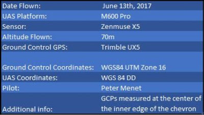
Figure 1: Metadata for Wolf Creek Paving.

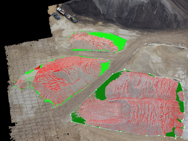
I started off by generating a polygon over the piles I was interested in calculating the volumes for, which can be seen in Figure 2 and 3. This I did with the Volumetric tool in Pix4D. The red color symbolizes the volume that is above the given projected surface while green identifies what is below the projected surface. I will come back to this later but for the Wolf Paving project, 293 meters was set to be zero value (ground).
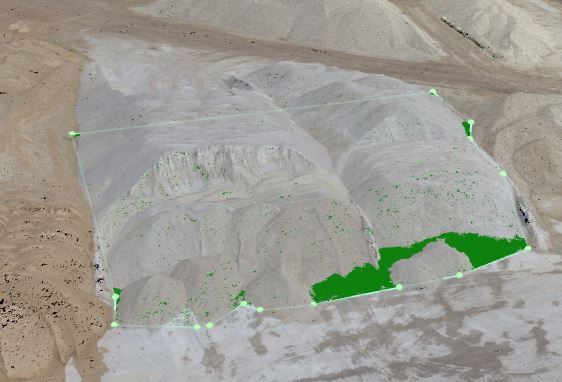
Figure 2: Polygon creation in Pix4DMapper.

Figure 3: The three piles

Calculating was also done in the same software and these were the results. Figure 4.
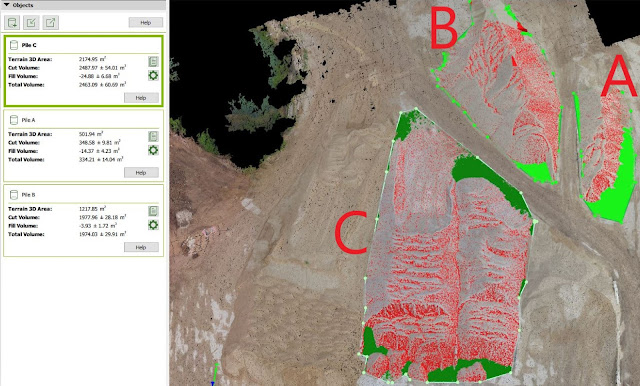
Figure 4: Order of the pile and the mass calculated


In order to see the differences between calculations between Pix4D and ArcMap, I had to do the same procedure there. ArcMap is not as easily maneuvered as Pix4D but maybe more precise. Let's see! First I had to create a new feature class for clipping a raster, but in that procedure, I had to choose the correct coordinate system like the other layers. Do it by right-click the database and choose New - Feature Class. This is easily done, but do NOT take for granted that you are in the correct system. Use the import function, as shown in Figure 5 to be sure that one uses the same coordinate system.
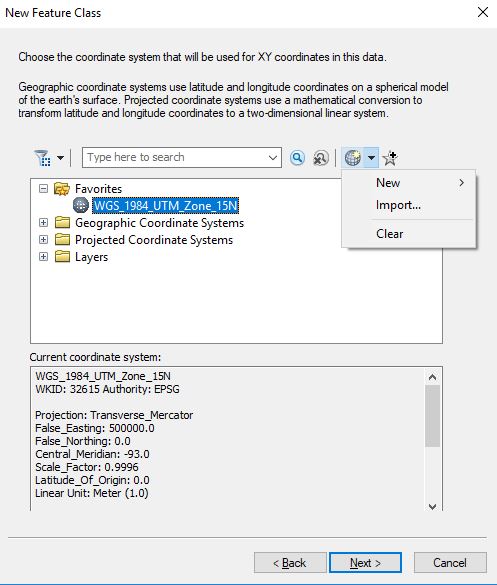
Figure 5: Choose the correct coordinate system.

I added to additional fields that could be especially important for this project. Figure 6.
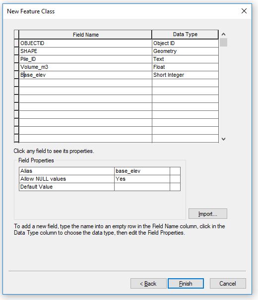

Figure 6: New fields

For Wolf Paving I created 3 polygon feature classes. After that, I was settled for creating the polygon. I had to start the editing tool and choose what Pile to draw a polygon over. Figure 7 shows, when I was in the process of drawing a polygon over Pile C, while Figure 8 displays the time when I did it for Polygon A. The three polygons will act like "masks" in the next step.
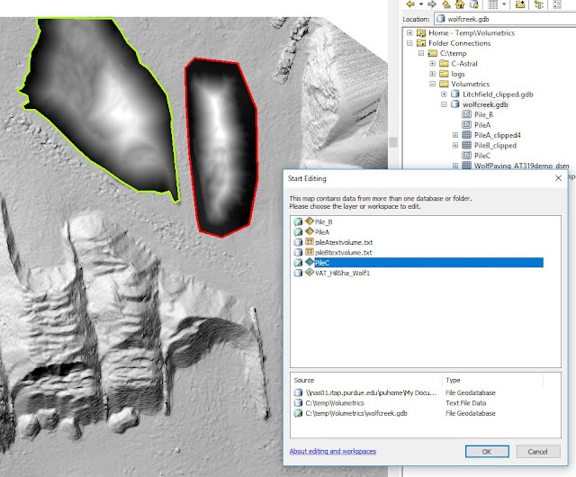

Figure 7: Polygon creation

Figure 8: Halfway through, a polygon creation looked like this (Polygon A)


When finished with creating the polygons it is of utmost importance to save (!!!) the progress under the Edit tab. Or else, the next step will not be able to go through. That step was about clipping a raster with the Extract by Mask tool. That is, I clipped the aggregate piles I did volumetrics on in Pix4D. What happens here is that one uses the whole Digital Surface Model (DSM) as input raster and the polygons one just made are used for determining where the surface model to be cut. The outcome of this operation is a "clipped" DSM version of exact that area we are interested in. Figure 9 displays both a polygon before the operation is done and two that are already processed. One should make sure to leave the area outside the pile, and don't cut the pile off. This area outside will be used to find a good number to use as zero value (elevation of the surface) when using the Surface Volume Tool. I used this back and forth to generate the volume for each of the raster clips I produce.
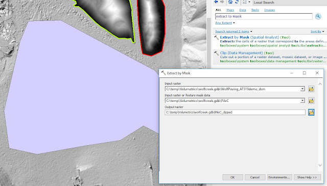
Figure 9: The Extract by Mask tool

Step after this is about calculating the volumes with ArcMaps Surface Volume Tool, Figure 10. This is where one chooses the plane height (zero value) from where the volumes will start to be calculated. As mentioned earlier in this text, the ground level for Wolf Creek was about 293 meters (over the geoid). At other places that are below sea level, for instance, eg Death Valley in California, one would have to choose BELOW here. As input raster goes the clip I created with the Extract by Mask tool above.
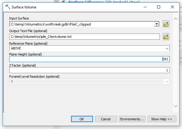
Figure 10: Surface Volume tool calculates the desired volume.

A text file with information will be created through this operation. This can be found in the Table of Contents to the left and looks like in Figure 11.
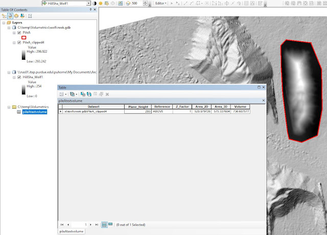
Figure 11: Volumes are displayed in cubic meters.


The volume of the calculated piles is shown in Figure 12 below. In cubic meters, the volumes for the three piles I was curious about. First the result I found up top, with Pix4DMapper and below, the numbers ArcMap gave me. There are some ArcGIS exaggerations, especially for Pile C. It was the largest yes, but ArcMap exaggerates that number almost 6 times, compared to Pix4D. For pile A, it is only a "modest" doubling. I know my fellow classmates received similar so reasons for this, has to be found out on Tuesday. Dr. will have to explain.

Figure 12: A compilation over the three piles I wanted to know the volumes for.


The results of the work over the Wisconsin project is presented below. The map displays the three piles, which the volumetric analysis was based on.
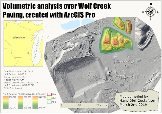
Figure 13: The legend shows the elevation values, and what pile they belong to.


Litchfield Mines

Next project. The database for the Litchfield mines had an orthomosaic and DSM from Sept 30, 2017. This geodatabase containing 3 flights from different dates, which displays how the mine alters over time. Figure 14 displays the mines at the End of the Third Quarter.
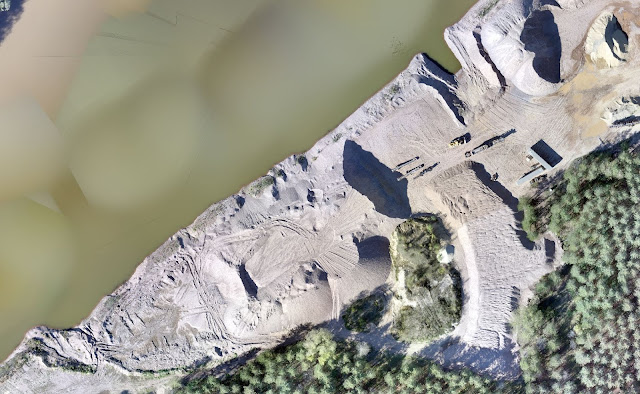
Figure 14: This is how the main part of the Litchfield mines looked like at the end of September

I engaged the Litchfield Mines about the same way as Wolf Paving site by calculating the volumetric data using three different data sets from three different dates.

As Figure 15 shows, it starts the same way by creating a new Feature Class.
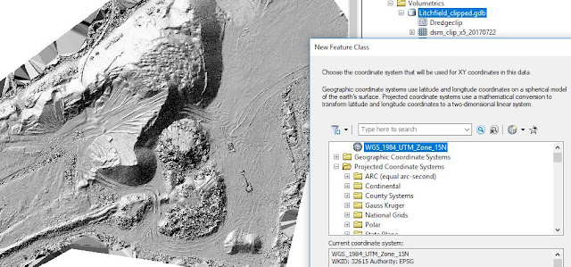
Figure 15: Remember how to find the correct coordinate system?

Below in Figure 16 is also the same principles made. This is after the Extract by Mask-tool has been used.
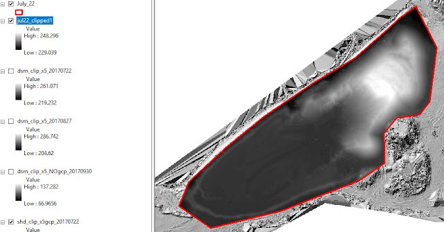
Figure 16: My clip for this polygon, I did create exactly the same way I did for the Wolf Creek project above.


Apart from the temporal aspect, where this Litchfield project got different is where one will start resampling. The method of doing this is to find the Geoprocessing Tool and search for Resample. As input goes the clipped Raster data set I just made. Checking the properties, this was on 2 cm precision level. I played some with this, which I will delve through at the end of this report, but the method for doing this is by choosing the size of each pixel. Figure 17 is a screenshot from when I generated the 5 cm layer.
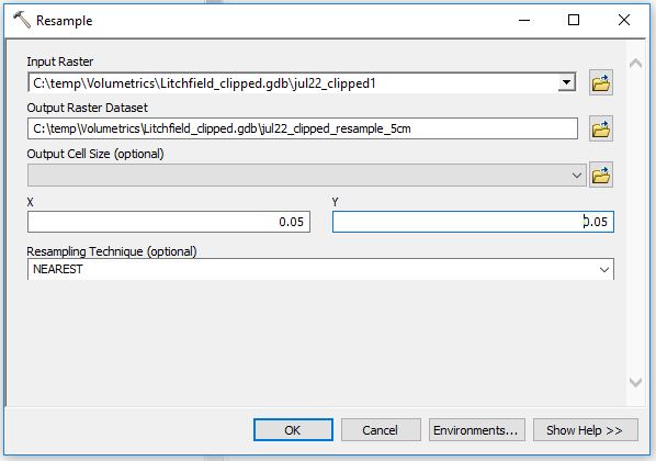
Figure 17: Resampling


After one has done the "Resample" to the new desired resolution (eg. from 2 cm start to 5 cm) one has to recalculate the volume through the Surface Volume tool. Shown in Figure 18.
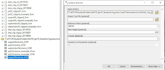

Figure 18: Using the Surface tool to get a new number.

I decided to find out the differences between 2cm, 5cm and 10cm. After I have done every step this was how my Table of Content looked, Figure 19. The initial DSM, July August, and September clips and the resampled versions of them. Also, I had the shaded clips here, but I did not create them, they came with the geodatabase.
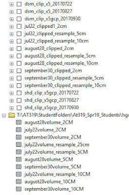
Figure 19: My Table of Content.


Figure 20 shows the map I created in ArcGIS Pro displays the mines site over a period from July 22nd till September 30th. These are the visuals and the discussion will be gone through in the next part.
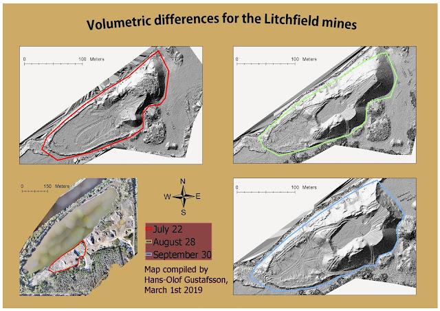
Figure 20: Bottom left is a map for the whole site and how the polygons for each date alters is also being displayed.


Discussion


There are always issues about quality and size. What quality does one actually NEED for a certain project? Well here are some tables I made for this purpose. I went deeper from what was expected and took a look at how the storage changed along with the resolution, Figure 21.

When calculating different data sets over a time span, sensors, altitudes, and spatial accuracies need to be consistent. That is the reason why I had to resample before making the volumetric analysis. This is also one of the key points to why this lab practice is important. Errors made early in the process will follow through the whole process. Consistency is important and in order to keep the UAS data trustworthy, one shall only compare apples with apples. 2 cm resolution data shall only be compared with 2 cm resolution data.
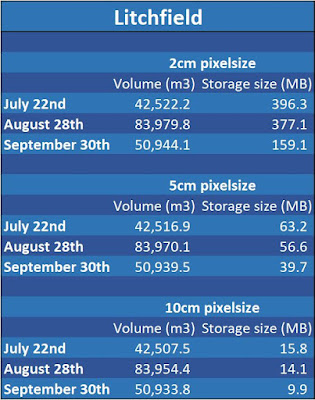
Figure 21: Overwhelming changes when scaling up the pixel size.

Figure 22 displays that starting at 2 centimeters pixel size the size of the file for July was just short of 400 MB.
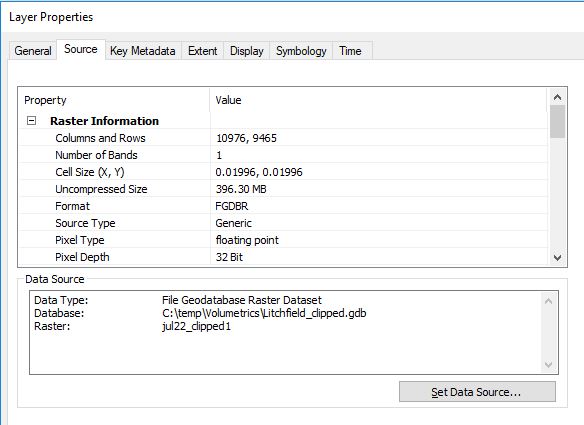
Figure 22: Wow! 396 MB worth of meatloaf for 2 cm.

Scaling up to 5 centimeters did not have any implications on the quality (which I will address further down) of the image at all, but a significant impact on the size of data, 63.2 MB. Figure 23.
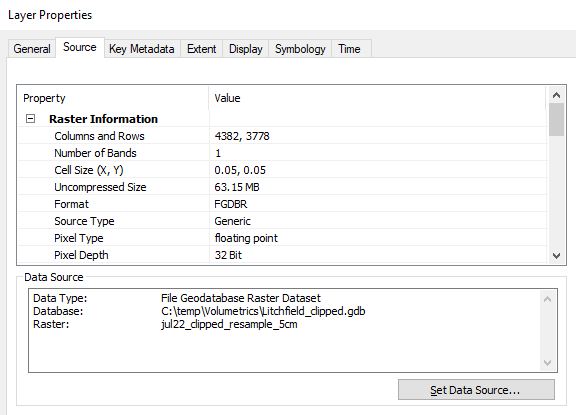

Figure 23: 5 cm pixel size


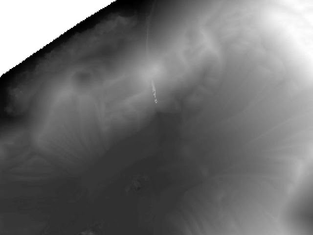
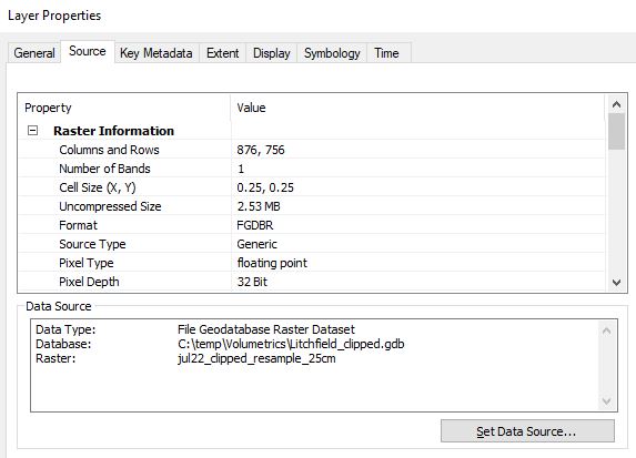
I even went down to 25 cm precision to see if I could spot a difference in quality, and I found a  divergence. In Figure 24 and Figure 25 it is possible to see the difference between 2 cm and 25 cm resolution. In Figure 26 one can see the dramatic fall in storage size as well, only 2.53 MB.
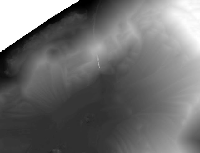
Figure 24: 2 cm

Figure 25: 25 cm

Figure 26: 25 cm storage size for the whole layer is only 2.53 MB.

Conclusion


Like mentioned above, for any project, calculating different data sets over a time period, the sensor, altitude and spatial accuracy need to be consistent. That is the reason why I had to do a so-called resampling before I made the volumetric analysis. And that is one key point to why this lab practice is important. Errors made early in the process will follow through the whole process. Consistency is important and in order to keep the UAS data trustworthy, one shall only compare apples with apples and so on. For this reason, 2 cm resolution data shall only be compared with 2 cm resolution data.

In ArcMap, I did resample the different raster data sets to new pixel sizes and produced a table over the results I found. The results shown in Figure 21 reveals it was definately (idiot-speak for "definitely") most volume covering the ground in late August. The volumes for September 30th shows that a great number of materials have been removed, which also can be seen in the images.
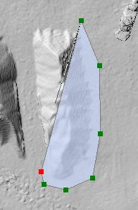
By reducing the quality from 2 cm pixel size to 25 cm pixel size and by that going from about 400 MB to 2.5 MB, many project managers for mines sites may choose to go for the poorer quality data sets. The second take of the results is that the actual volume does hardly change at all after the resample. The volumes for July22 with 2 cm pixel size is 42,522 m^3, while with 5 cm pixel size it was 42,517 m^3 and finally with 10 cm pixel size it was 42,508 m^3. Thus, by reducing the precision and resolution of the volumes for the whole period drops only 3 per thousand.