This page contains 7 non-compulsory assignments, that the members of the class were allowed to choose individually in order to learn ArcGIS and other ESRI software on a more fundamental level.
Tutorial 1: 3D Analysis of Surfaces and Features Using ArcGIS
Exercise1: Analyze visibility along a parade route
ArcScene was the software to use for this specific exercise.
 |
| Figure 1: The Observers layer, zoomed to layer |
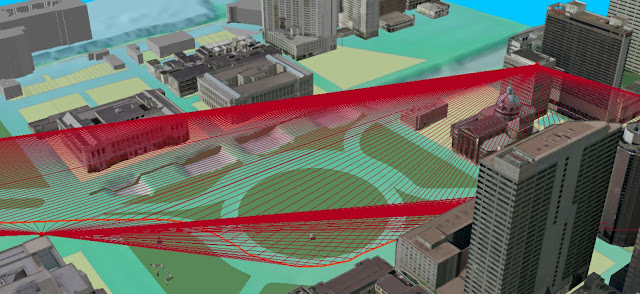 |
| Figure 2: The Sight Lines between each of the observer points and the parade route., 30 feet apart along the parade route. |
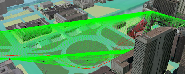 |
| Figure 3: The green lines are the visibility between the observer points and the parade route along each of the sight lines and the red ones is not visible. |
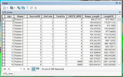 |
| Figure 4: The "Add Z Information"-tool calculates 3D view distance, hence the 3D length to each of the line-of-sight lines. |
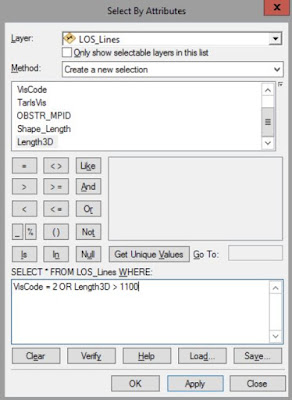 |
| Figure 5: Here the line-of-sight lines that are obstructed from viewing the parade route or offer views that are too distant are removed. In clear weather, 1,100 feet is the maximum distance one usually use. |
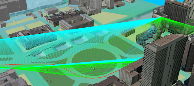 |
| Figure 6: The selected lines which now will be removed. |
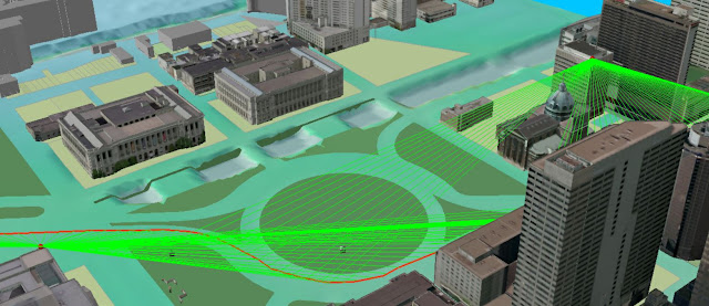 |
| Figure 7: The output results look like this. This is what parts of the parade route can be seen by the two observers, given maximum visibility of 1,100 feet. |
 |
| Figure 8: All the steps in the Model Builder. Reduced visibility is a normal issue that comes as a result of changing atmospheric conditions such as rain, fog, or smog. Here I repeat the visibility analysis of the parade route but assume maximum visibility of 600 feet. A model to automate the tasks I performed in the previous steps was found on ESRI's webpage. The model contains the same tools I used in the earlier steps but this time, the visibility distance will exclude the line-of-sight lines that are longer than 600 feet instead of 1100 feet. |
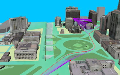 |
| Figure 9: The final output. At reduced visibility distance of 600 feet, there is insufficient visibility coverage using only the existing two observers points. |
Exercise 2: Determine maximum building height for a development
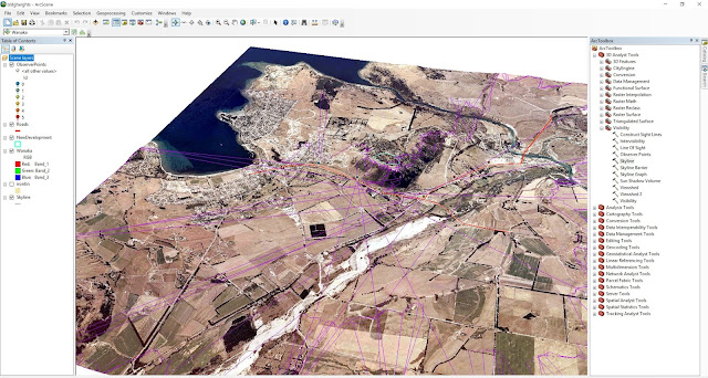 |
| Figure 10: Creating a skyline for each observer |
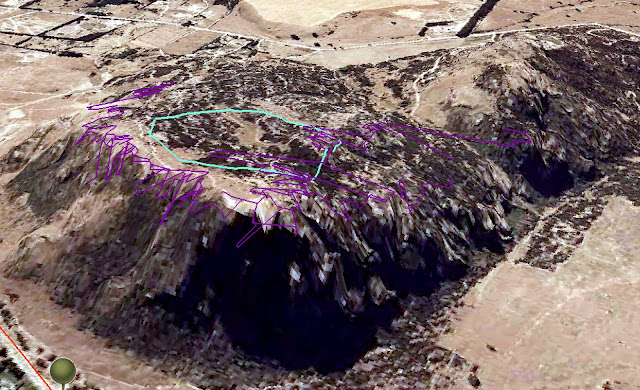 |
| Figure 11: Zoomed in |
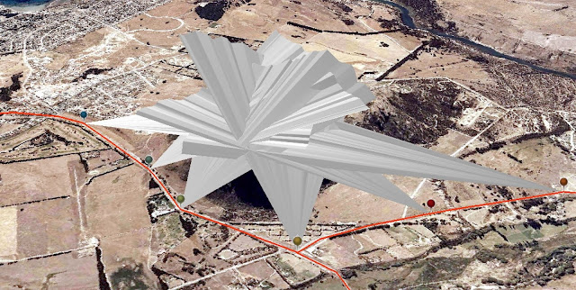 |
| Figure 12: Creating a skyline barrier for each observer |
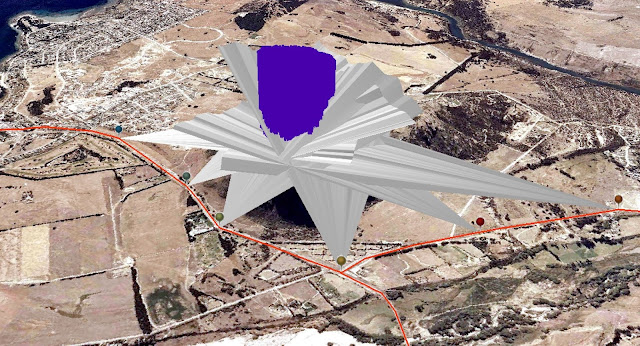 |
| Figure 13: Creating random lines within the study area |
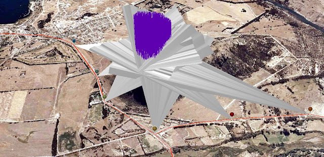 |
| Figure 14: Turning the extruded points into a feature class of lines. |
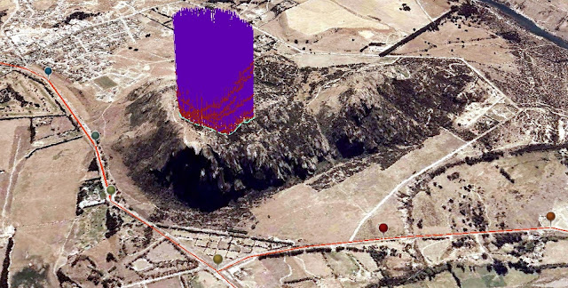 |
| Figure 15: Intersecting the random lines with the skyline barriers |
 |
| Figure 16: Determine maximum possible volume to build. This is the new created TIN from the points. The new TIN represents the maximum height that any new building cannot surpass. |
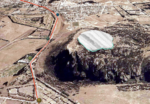 |
| Figure 17: This step extrude between the new TIN surface and the original TIN elevation surface to create a volume that visually represents the total 3D area available for new development. |
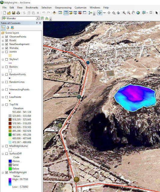 |
| Figure 18: Maximum building height |
Exercise 3: Determine the potential path of a mudflow
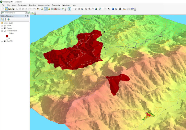 |
| Figure 19: Exploring potential mudflow paths |
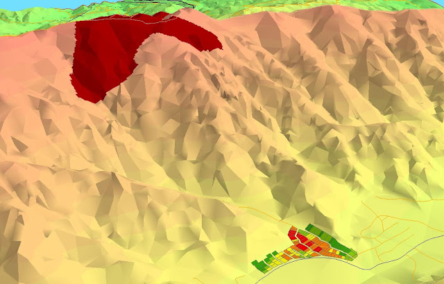 |
| Figure 20: Zoomed in |
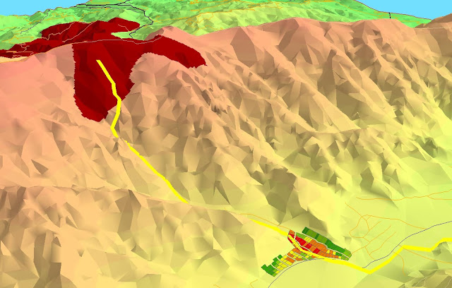 |
| Figure 21: Creating and customize a path (yellow) |
 |
| Figure 22: The Parcels zoomed in in ArcMAP, which was used to create the steepest path. |
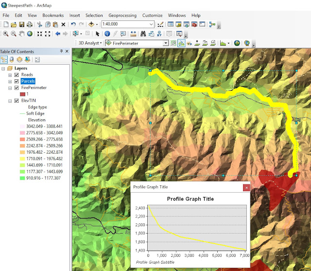 |
| Figure 23: Creating a profile graph from the steepest path result. |
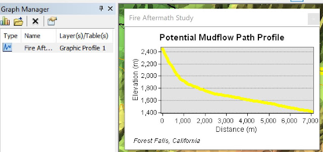 |
| Figure 24: Using the Graph Manager to customize the graph |
Exercise 4: Calculate area and volume
This exercise teaches the use of 3D Analyst to calculate the area and volume of a surface above or below a specific elevation. Referring to ESRI, it is possible to determine how much fill material would be produced for road construction if one cuts off the top of a hill at a given elevation. Or one can estimate the volume of water a river valley would hold if the river were dammed and flooded to a particular elevation. Area and volume calculations can be processed through ArcMap or ArcScene using TIN or raster data.
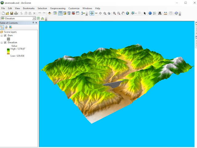 |
| Figure 25: Data to work with. |
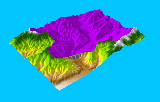 |
| Figure 26: The Basin layer draped over the elevation layer. |
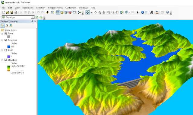 |
| Figure 27: Creating the reservoir by reclassifying elevation values within the watershed upstream of the dam |
Next step is to calculate the surface and volume statistics for the reservoir using the Polygon Volume tool. However, to do that one has to convert the water surface to a polygon feature class and the elevation surface to a TIN before using this tool.
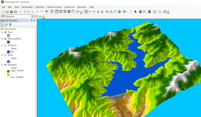 |
| Figure 28: The new polygon created from the raster. |
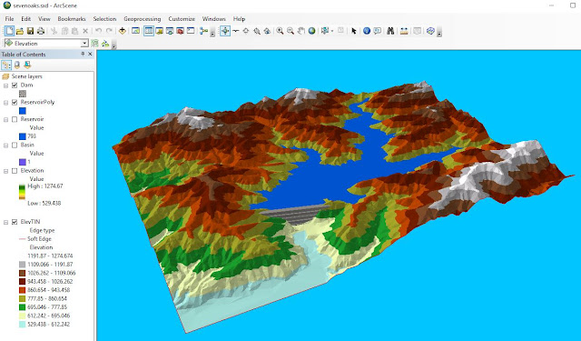 |
| Figure 29: The new TIN. |
 |
| Figure 30: Calculate the reservoir depth. The "Volume" field represents the estimated amount of water the reservoir holds while the "SArea" field represents the surface area of the water. |
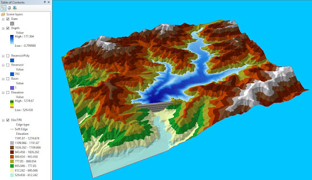 |
| Figure 31: The new raster is symbolized according to the depth within the reservoir. |
 |
| Figure 32: Finally done with this long exam. |
Tutorial 2: Performing Line of Sight Analysis
 |
Figure 27: This was a shorter exam.
|
Tutorial 3: Extract Roof Forms for Municipal Development
One of the best ways to determine the heights of a large number of surfaces is with LiDAR. To create 3D buildings with detailed roof forms and accurate heights, one has to know forms and heights.
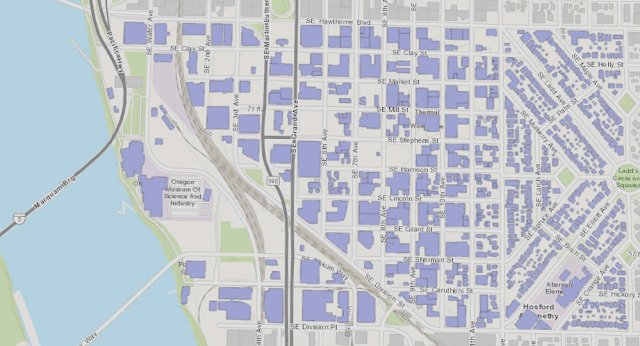 |
| Figure 1: The project I downloaded from ESRI's web page contains a view of the area of Portland. The scene includes 2D building footprints that give an idea of the types of land use in the area, namely, smaller residential neighborhoods to the east and larger industrial districts closer to the river. |
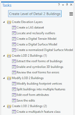 |
| Figure 2: The tasks to perform in this tutorial |
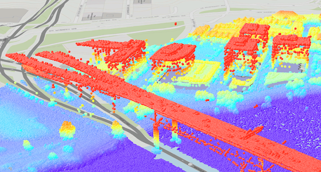 |
| Figure 3: After the first task is finished (remember to check the coordinate system is the same as the map), the LAS point cloud dataset is added to the scene. |
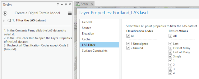 |
| Figure 4: Creating a DTM with LiDAR. This dataset has only two codes: 1 Unassigned and 2 Ground. The return values regard the echoes from the LiDAR data. |
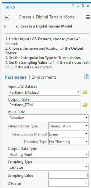 |
| Figure 5: These were the settings I used. I set the interpolation type, or the algorithm used to determine the values of each individual pixel in the output raster dataset. The Binning interpolation type determines cell values based on LAS points within the cell's extent, whereas the Triangulation interpolation type determines cell values based on a TIN (Triangulated Irregular Network) surface created using the points. Binning is a more efficient method for large areas with dense data, while triangulation is better for areas with low or varying densities of points. Because this area is fairly small, with relatively dense point spacing, either method would be appropriate. Triangulation makes sharper details in areas with large changes in elevation, such as building edges or where high trees are. The sampling value affects the resolution of the raster. Smaller cells create more detailed and accurate datasets, but if the cell size is too small, processing time will increase. A cell size of 1 foot will be sufficient to extract accurate roof forms. |
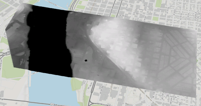 |
| Figure 6: This is the results for the DTM creation. The new raster layer shows only the ground elevation. Darker areas have lower elevations, while lighter areas have higher ones. The locations of buildings still show up a little bit. |
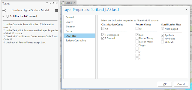 |
| Figure 7: Creating a Digital Surface Model. These settings will filter points to show only the last returned values of the LiDAR scanner. Sometimes, a single pulse from a LiDAR scanner can have multiple returned values at different distances from the scanner. |
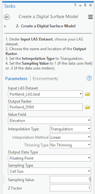 |
| Figure 8: The same settings that I used before when creating a DTM. |
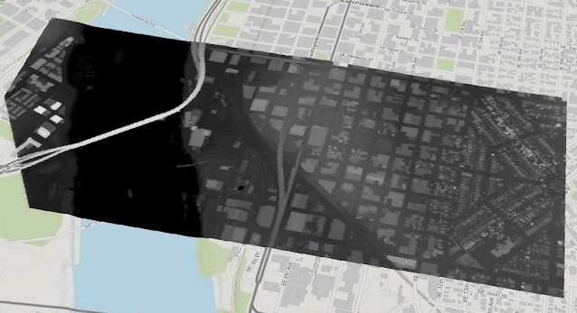 |
| Figure 9: The DSM result |
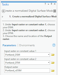 |
| Figure 10: This is how I created a the nDSM. This final elevation layer I made was a normalized Digital Surface Model (nDSM). Unlike the previous two elevation layers, which were made from the LAS dataset, the nDSM is made by subtracting the values in the DTM from the values in the DSM. Because the DTM shows the ground elevation and the DSM shows the elevation of the features on top of the ground (the absolute elevation), an nDSM shows the height of features above ground (the normalized elevation). The Extract Roof Form tool will use this layer to accurately process areas where roofs are expected to be. |
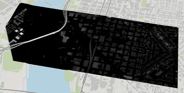 |
| Figure 11: This is how the nDSM looks. The nDSM shows the relative height of the structures. Below is the other elevation layers. |
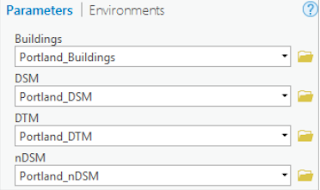 |
| Figure 12: To extract the roof forms from the buildings I used the information I received from Elevation Models. |
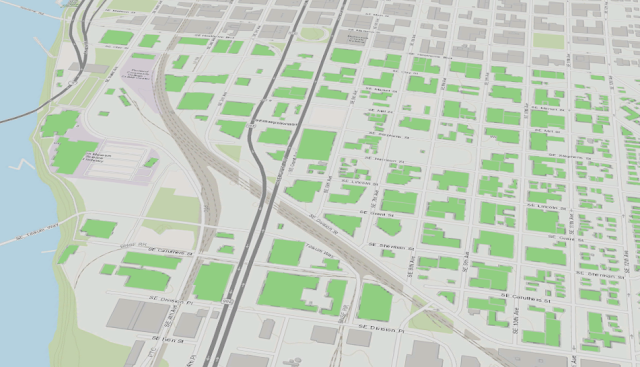 |
| Figure 13: The results |
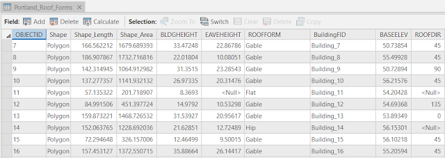 |
| Figure 14: Type of information one can find with the Extract Roof Form tool based on the elevation layers and building footprints. |
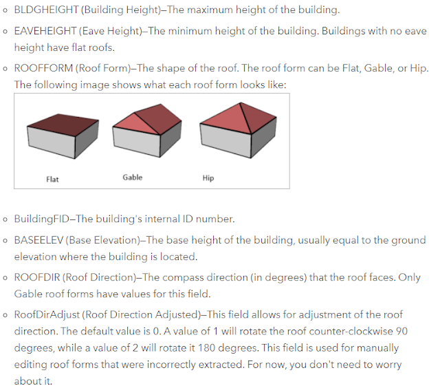 |
| Figure 15: From ESRIs webpage, short information about the different fields found in Figure 14. |
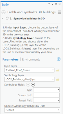 |
| Figure 16: Symbolizing 3D buildings |
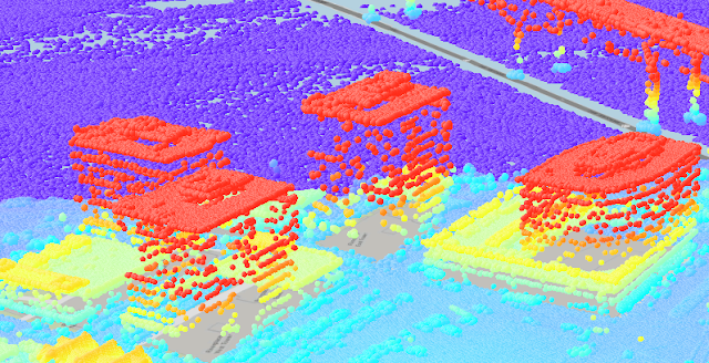 |
| Figure 17: Thus, out of this point cloud........ |
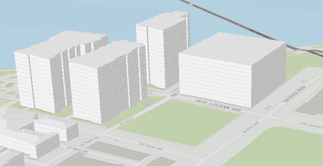 |
| Figure 18: ....this was created. Comparing these to images, one easily see that there are some error, but this can be solved. |
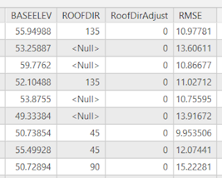 |
| Figure 19: So how accurate was the tool? RMSE is the difference between the values in the roof forms layer and the values in the DSM. A higher RMSE indicates a higher error. To quickly visualize which buildings have a high error, you'll symbolize the layer by RMSE. |
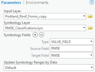 |
| Figure 20: It is also possible to symbolize the errors. |
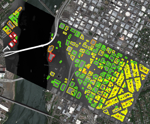 |
| Figure 21: This is the result. Red means higher values of error. |
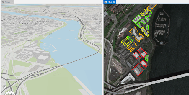 |
| Figure 22: The scene zooms to the same building that is zoomed to in the map. The Map and Scene view tabs also have a link icon now, which indicates that the views are linked in this project. When views are linked, navigating in one view will simultaneously update the extent of the other view. To do this, just drag the map tab to the center of the screen/map/view. |
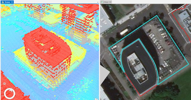 |
| Figure 23: Through some steps from last image I split the inital buildng with the biggest RMSE because the parkinglot was included. After my editing the image looked like the left on this image. The right part is what I excluded. |
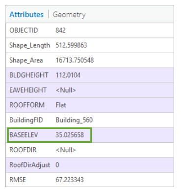 |
| Figure 24: The base elevation of the building is 35 feet. If the true elevation of the parking structure roof is approximately 75 feet, that means the building height is 40 feet. |
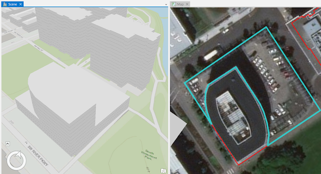 |
| Figure 25: Just some clicks away I adjusted the heightThe LAS points have the true elevation of the point, the BLDGHEIGHT attribute in the roof form features has the maximum height of the building. Because of this one needs to subtract the base elevation of the building from the elevation of the point I clicked to get the elevation for the BLDGHEIGHT attribute. |
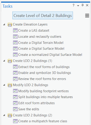 |
| Figure 26: The tasks for this tutorial are the following. |
Tutorial 4: Performing Viewshed Analysis in ArcGIS Pro
Tutorial 5: Get Started with ArcGIS Pro
Explore the study area
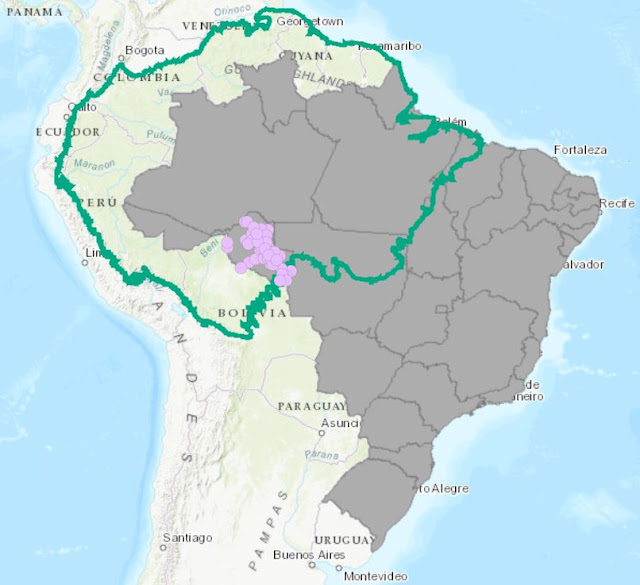 |
Figure 15: Feature classes store 3 main data types: point, polyline, and polygon. A feature class is a storage structure that stores the geometry and attributes of spatial features. The ArcMap document I downloaded contained 3 feature classes. The Amazon region, the Brazilian states and the cities in the state of Rondonia. Both the Brazilian states and the Amazon region are polygons (though Amazon looks like polylines it is not, shown are the polygons border) and the cities are points.
|
 |
| Figure 16: Geographic data is most efficiently stored in geodatabases. They can easily be compressed and can have both spatial and attribute validation applied to the features within. Like the images displays, there are two geodatabases in this Databases folder. The one titled Rondonia Deforestation.gdb is my default geodatabase that I created when I made the project. The second geodatabase is the one I added. |
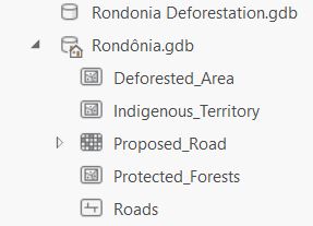 |
| Figure 17: Eg, this geodatabase contains 4 feature classes (3 polygons and 1 polyline) and 1 raster dataset. |
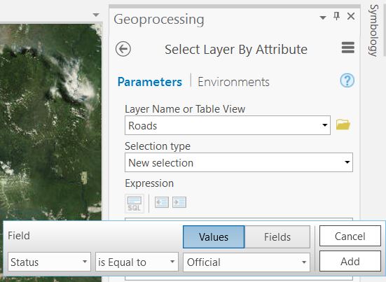 |
| Figure 18: Through "Select Layer By Attribute" in the "Geoprocessing pane" I reached the Query builder. There, I created this expression in order to select the Official roads and after that export this piece of data into a new layer. |
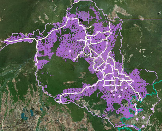 |
| Figure 19: The result after some fixing. |
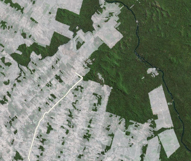 |
| Figure 20: Deforestation areas sometimes ends abruptly with sharp boundaries. This is where deforested areas protected areas. |
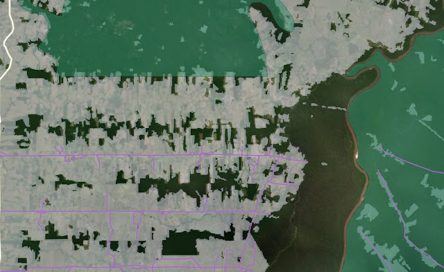 |
| Figure 21: Strong relationship between roads and deforestation, illustrated via the Swipe tool. |
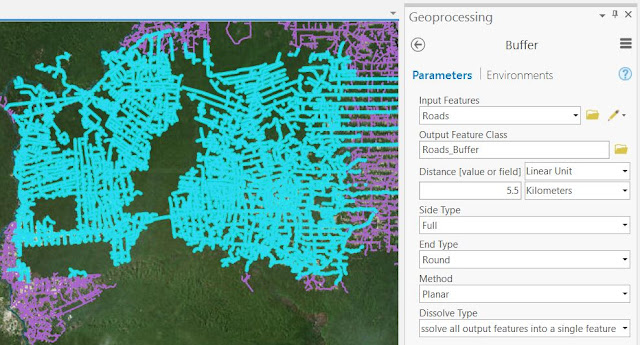 |
| Figure 22: In blue-green, I have a sample of roads selected. Now I will use the Buffer tool to analyze this sample. This tool creates an offset at a specified distance from the input features. Using the deforestation data, it will calculate that most deforestation happens within 5.5 kilometers of roads. This tool creates a polygon feature representing that area. The Dissolve Type option in this case buffer all of the highlighted features and makes only the outer boundary of the buffer visible. |
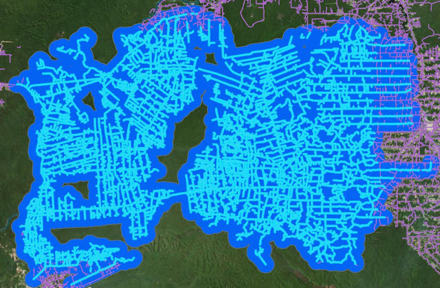 |
| Figure 23: After the buffering. Roads are selected here. |
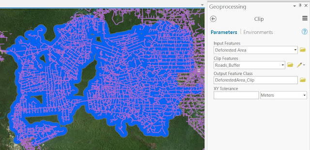 |
| Figure 24: To calculate the percentage of the buffer that is deforested, one needs a layer of deforestation within the buffer. This layer (DeforestedArea_Clip) is created using a geoprocessing tool called Clip. It is not only enough to highlight it. The Clip tool clips the extent of one layer to the extent of another. Under the Analysis tab, I searched for "Clip". |
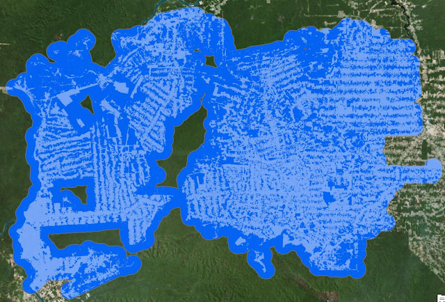 |
| Figure 25: This is the result. The process created a new layer (DeforestedArea_Clip) to the map. In outer blue (Roads_Buffer) is the buffer layer I created before. |
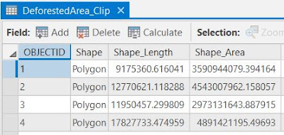 |
| Figure 26: The attribute table of Deforested area |
 |
| Figure 27: The attribute table of Roads Buffer. Here I choose "Add Field" in order to create a field that I named to "Percent Deforested" |
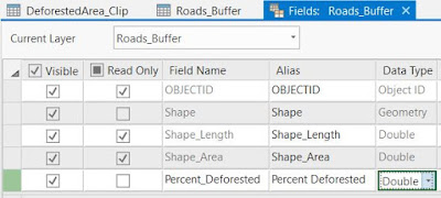 |
| Figure 28: Wrote this and choose Double because it allows decimal numbers. |
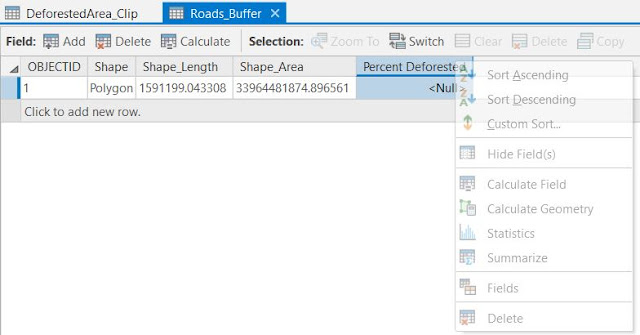 |
| Figure 29: From here it is possible to calculate the fields |
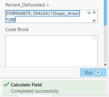 |
| Figure 30: For the first polygon the deforestation was calculated. |
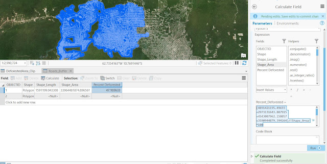 |
| Figure 31: For all four of my polygons the calculations looks like this. Based on the example area values, the value returned was about 47.1 percent. Know we know the percentage of land within 5.5 kilometers of roads that are deforested. If a new road were built in this sample area, one could predict that 47.1% of the land within 5.5 kilometers of that road would become deforested. When one has the value, the Deforested_Area_Clip layer is no longer necessary. I remove it from my map but keep the Roads_Buffer layer because it has the percentage value in its attributes. |
Predict the impact of the proposed road
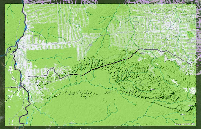 |
| Figure 32: Planning for a new road |
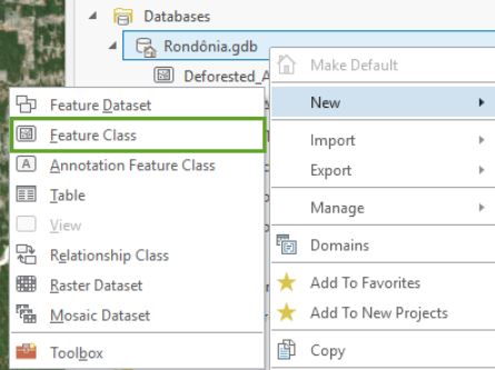 |
| Figure 33: Creating a feature class allows the user to create vector data. I will base the new vector line feature on the raster image. |
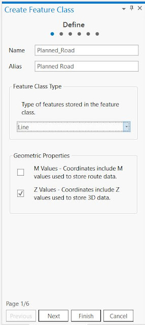 |
| Figure 34: First step in order to create a new feature class |
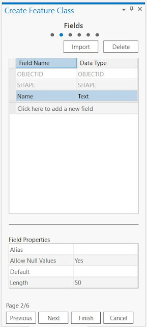 |
Figure 35:
| Figure 34: Second step is to add fields to the data. I will add two fields, Name and Status, such as found in the Roads feature class. |
|
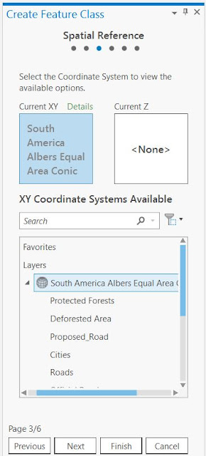 |
| Figure 36: Last step is to choose the feature class's coordinate system. I will use the coordinate system used by the layers already on your map. After this I go into the Catalog pane and drag the Planned_Road layer into the Contents pane below the Roads layer. |
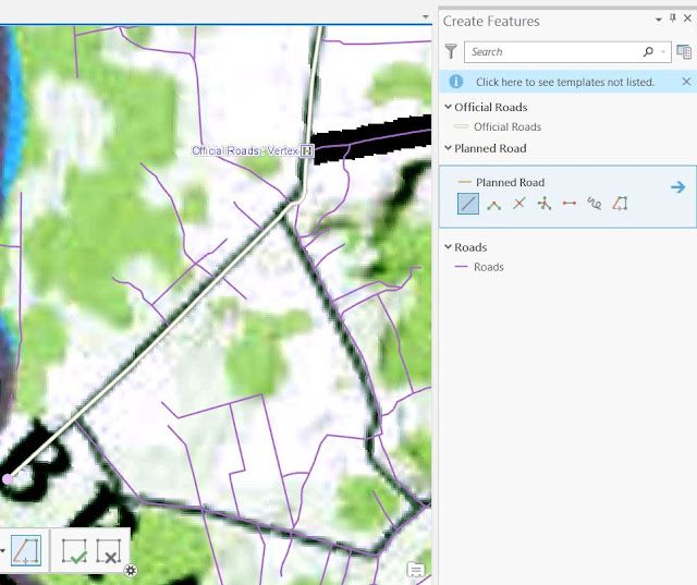 |
| Figure 37: Next thing to do is to digitize the data from the raster image (the proposed road data) and store it in the new feature class. I go to the Edit tab and choose "Create" and this screen shows up. |
 |
| Figure 38: The tools to choose from. The Trace tool is a useful one, that allows the user to just use the mouse to choose what to be selected. |
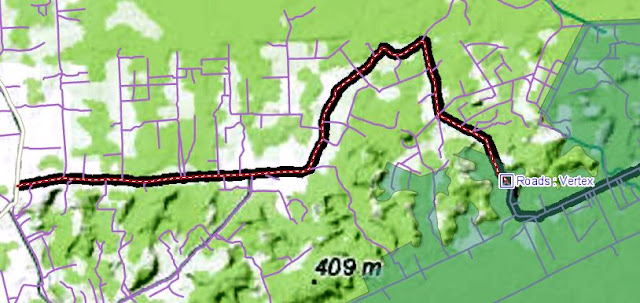 |
| Figure 39: The Trace tool was used here. On the long straight lines, I used the Line tool. |
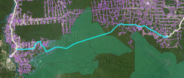 |
| Figure 40: After the last vertex is added the proposed road is digitized and connects the two official roads (in white). |
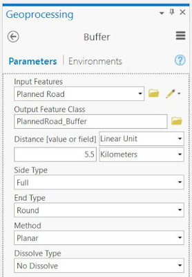 |
| Figure 41: When to find the potential deforestation of the road, one has to use the buffer tool. To find the total area (not percentage) of the potential deforestation around the proposed road, I have to buffer the Planned Road layer to the same 5.5-kilometer distance and multiply that buffer area by the percentage of deforestation I observed around existing roads. Also, I have to remove areas of existing the deforestation so they won't be included in your total. Because there is only one single feature to buffer, I do not have to do anything with "Dissolve Type" option. |
 |
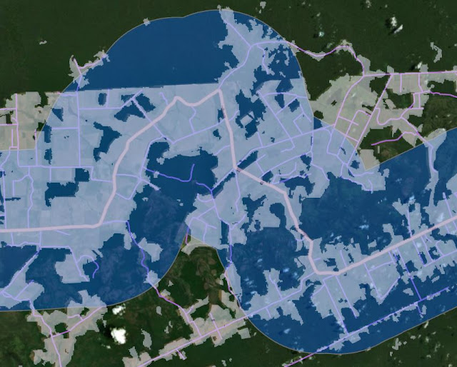
| Figure 42: The result of this buffer operation. |
 |
| Figure 43: Activating the Deforestation layer and stacking it above the buffer layer, this is the result. Like we can see here, there are some areas where deforestation has already occurred and I do not want to include the already deforested areas into my analysis. |
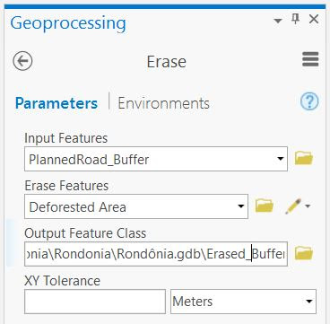 |
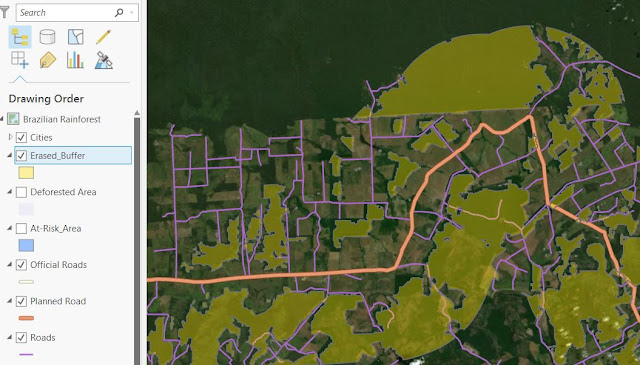
| Figure 44: Therefore I will remove the existing deforestation from the buffer with the Erase tool. The Erase tool subtracts parts of one layer that overlap another layer. However, the Erase tool is not one of the tools that can be accessed from the Geoprocessing menu. Instead, I will have to search for it. And add this information. |
 |
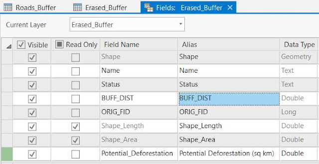
| Figure 45: In Yellow (Erased_Buffer) is now the area that we DID erase. To find out how much of this yellow area would have been deforested, I multiply the area by the percentage value I obtained earlier. This value is stored in the attribute table of the "Roads_Buffer" layer. It was 47.1%. |
 |
| Figure 46: I right-click the "Roads_Buffer"-layer and open the Attribute Table. Copy the "Percent Deforested"-value and open the attribute table for the "Erased Buffer"-layer. Click Save in the Menu. |
 |
| Figure 47: The new field has been created, and here one clicks the Calculate button. |
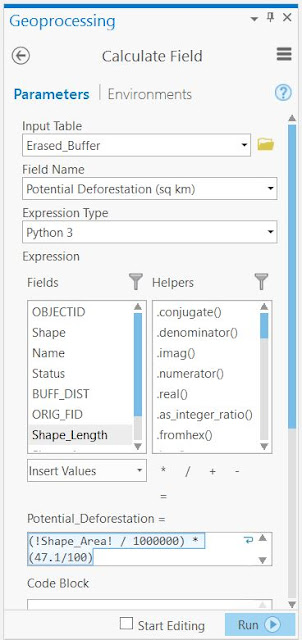 |
| Figure 48: The first part converts the buffered area, in square meters to square kilometers. The part of the expression takes on the share (47.1%) of land we already know is deforested. |
 |
| Figure 49: Thus, the entire expression in Figure 48 tells us how much forest there will be saved if the roads are not built. |
Finish and print the map
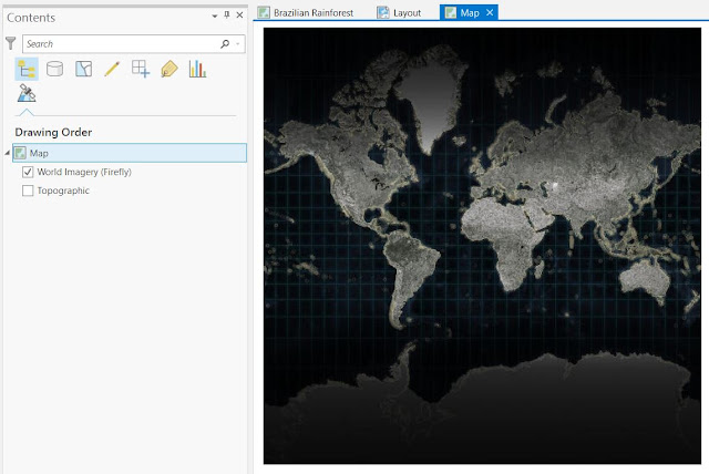 |
| Figure 50: A nice feature with ArcGIS was that from this World Imagery map it was possible to project it on a globe by changing coordinate system. The Results is shown in Figure 52. |
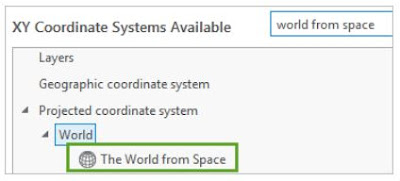 |
| Figure 51: Changing coordinate system |
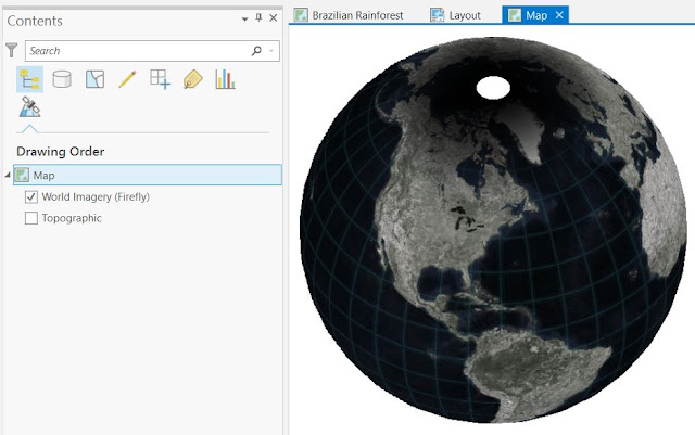 |
| Figure 52: The result looks like a view of the Earth from space. However, it does not show the area of Brazil. |
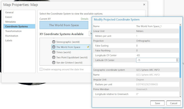 |
| Figure 53: By right-clicking The World from Space and choosing "Copy and Modify..." the Longitude and Lattitude is possible to change. |
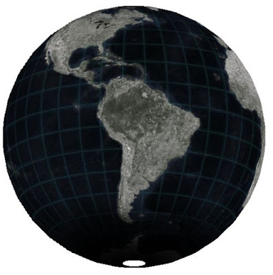 |
| Figure 54: The result after the change. |
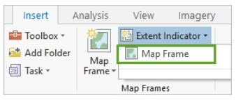 |
| Figure 55: By having the World map selected in the Contents pane, one can go to Extent Indicator and choose Map Frame. By doing so an extent indicator will be added to the continent of South America. |
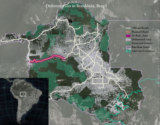 |
| Figure 56: This is the result. The Dynamic text is removed. |
Tutorial 6: Get Started with Imagery
To discover the capabilities of imagery, I will travel around the world and look through the lenses of several band combinations on the electromagnetic spectrum, including some invisible to the human eye. For this tutorial, I used the Esri Landsat app, which can be found
here.
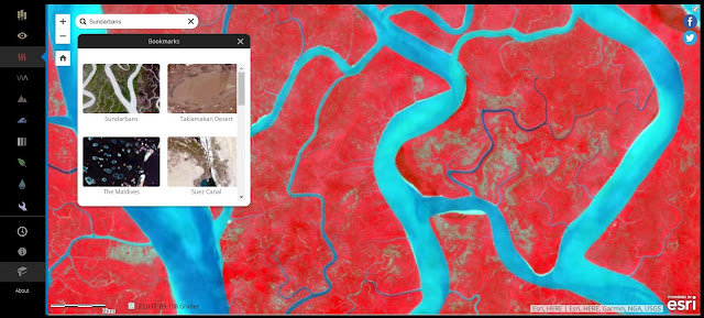 |
| Figure 5: The Color Infrared band combination also allows the user to monitor vegetation health. Healthier vegetation appears brighter red. Although most of the vegetation in the current view is pretty bright, some parts are brighter than others. However, some areas appear unhealthy or are missing forest cover. What could have been going on here? |
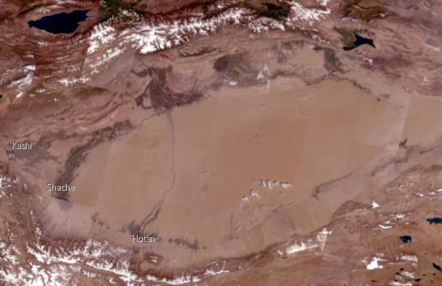 |
| Figure 6: The Taklamakan desert appears dry, but one can find moisture using spectral bands. |
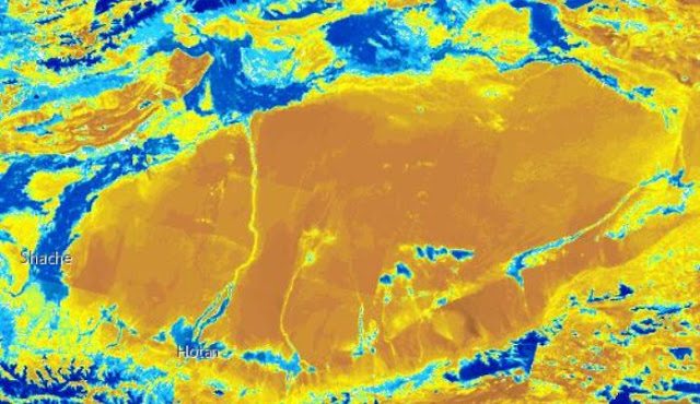 |
| Figure 7: Unlike Color Infrared, which was only a combination of three different spectral bands, the Moisture Index is a calculation of values of various bands to find moisture-rich areas. It is not showing visible moisture but highlighting areas where moisture is likely to be. |
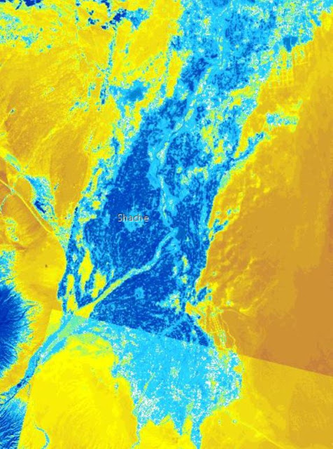 |
| Figure 8: The Moisture Index reveals a few places in the Taklamakan Desert that are not as dry as they seem. This area is fed by a river that runs down the nearby mountains. Like in the figure above, the Moisture Index shows that this area is abundant in moisture, but does not reveal what that moisture is being used for. This is possible to find out using a spectral band combination. |
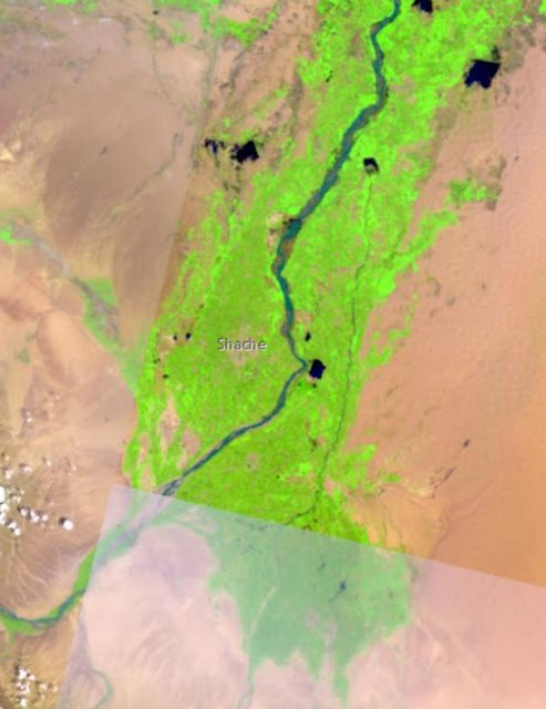 |
| Figure 9: This area is fed by a river that runs down the nearby mountains. Like in the figure above, the Agriculture band combination highlights agriculture in bright green. Most of the moisture-rich area using the Moisture Index coincides with agriculture for obvious reasons. One of the reasons that one has to be cautious when making a visual analysis of satellite imagery is that the Moisture Index sometimes indicates areas of the desert as moisture-rich due to cloud cover rather than agriculture on the ground. |
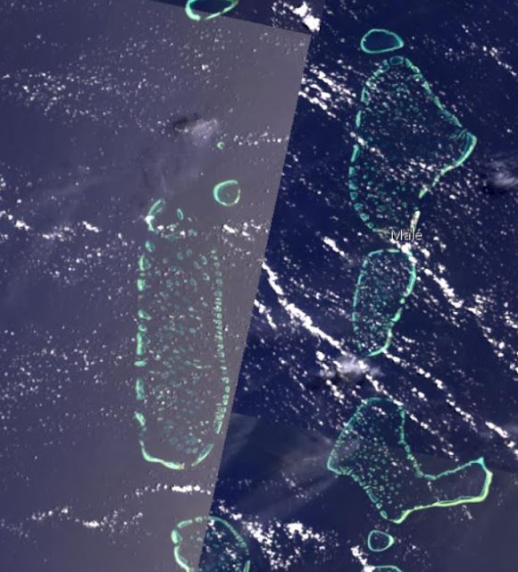 |
| Figure 10: The Maldives is made up of over a thousand small, low-lying islands. |
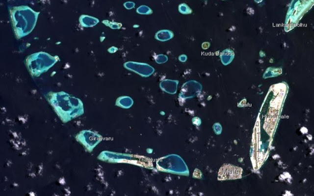 |
| Figure 11: The Bathymetric band combination is a better choice here since it emphasizes underwater features. With Landsat imagery, you can monitor how sea level rise affects these low-lying islands. |
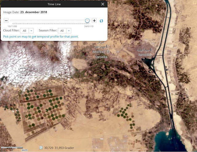 |
| Figure 12: What if I want to track trends over time? This image over the Suez Canal in Egypt was taken in December 2018. Nowadays, two canals running parallel to each other. |
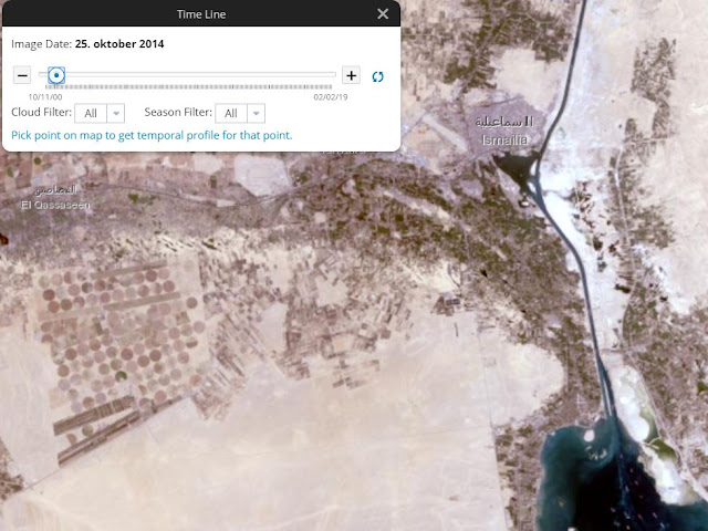 |
| Figure 8: It was not like this before Christmas in 2014, when it was built. However, looking closely there seems to be a small trace of the second canal will show up. Besides date, this Timeline tool allows the user to filter the imagery based on cloud cover. For instance, if I set the cloud filter to 40%, any imagery with more than 40 % cloud cover will be neglected. |
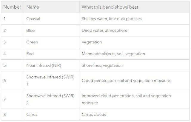 |
| Figure 9: Landsat imagery measures ranges of wavelengths of the electromagnetic spectrum, including some like infrared that is invisible to the human eye. It is possible to combine bands and are described in this table. |
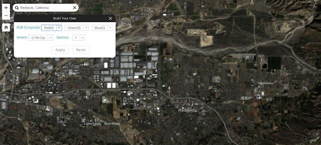 |
| Figure 10: So what bands should your combination use? It depends on what you want to see. Bands 4, 3, and 2 (Red, Green, and Blue) produce the spectrum of light visible to human eyes. This band combination, which this image displays, combines these three bands to approximate how imagery would look. |
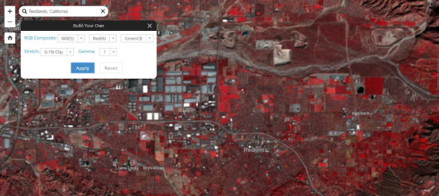 |
| Figure 11: If I wanted to see vegetation, I may use the Color Infrared combination which makes up of bands 5, 4, 3 (Near Infrared, Red, and Green). |
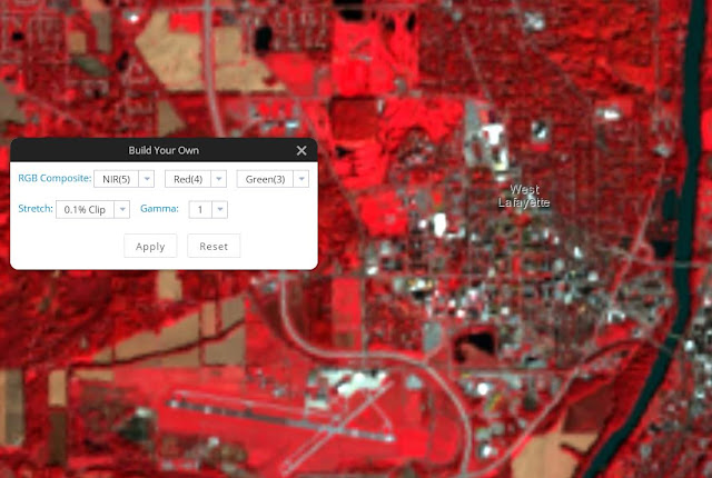 |
| Figure 12: Area over Purdue University in the Infrared combination. useful to find the healthy areas, golf course found in the mid-north area of the image. |
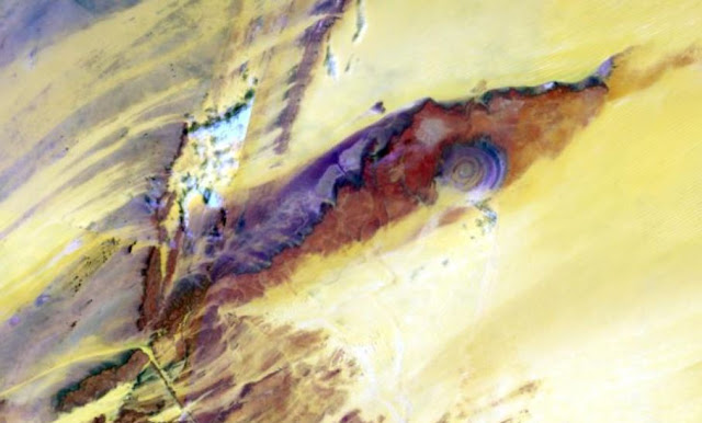 |
| Figure 13: In West Africa is the famous, so-called The Eye of Sahara situated. It is speculated that this could be the Ruins of Atlantis. |
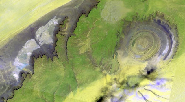 |
| Figure 14: Is it possible to solve the enigma by zooming in and using different band combinations? |
Tutorial 7: Get Started with ArcGIS Earth
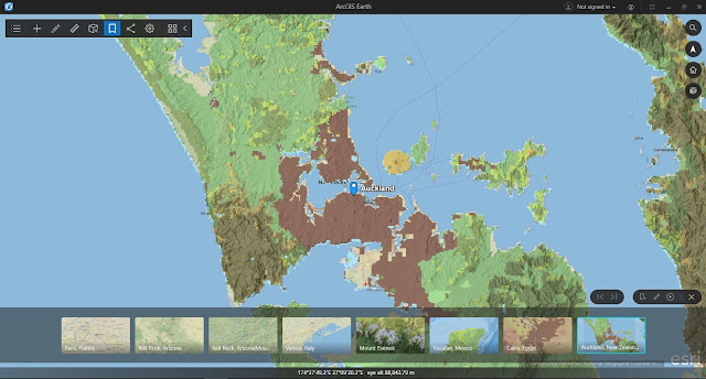 |
| Figure 1: Bookmarks over chosen destinations. |
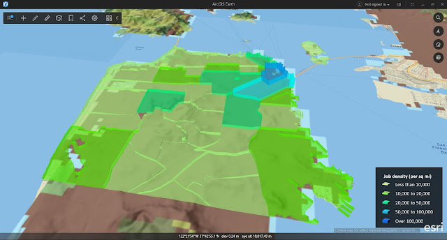 |
| Figure 2: The number of jobs per square mile in San Francisco. |
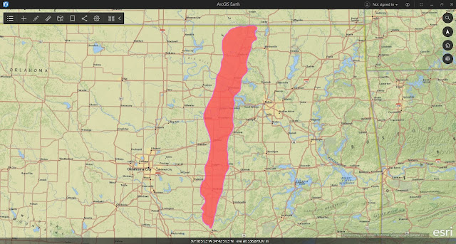 |
| Figure 3: Area of east-central Oklahoma and displays the Ada-Vamoosa aquifer. |
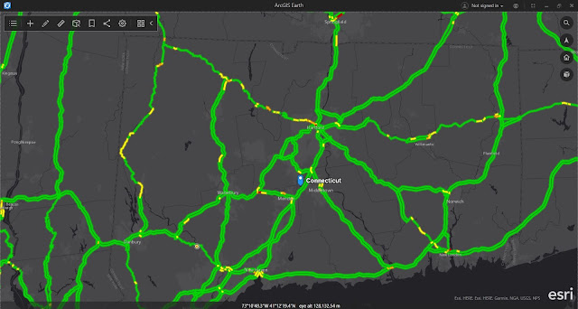 |
| Figure 4: Traffic incidents in Connecticut, displayed on top of the National Geographic basemap. |




No comments:
Post a Comment